Redesigning the site structure for improved usability.
Background. 🌈
Overview
The dashboard is a tool that houses many applications and functionalities within a single program. This resulted in difficulty for users to navigate and perform specific functions. Additionally, new users find the navigation confusing during the onboarding process.
I was tasked to improve on information architecture, navigation and content layout of the siteon a responsive platform for desktop, tablet and mobile.
Problem
How do we improve on the information architecture for ease of use and efficiency of the system?
How do we incorporate branding and typography to make content easy to digest yet functional?
Role
UX Designer
UX Design, UI Design
February 2021 - April 2021
Note
❗Due to NDA, I can only share a broad overview of this project. Some images may be altered. Please reach out to learn more!
The process. 🍡
Gathering Requirements. 📓
We kicked off the project by understanding our client's objectives and goals for the redesign. The aim here is
- To display information in a manner that is easy to understand and meaningful.
- To not overload users with too much information.
- To design an intuitive dashboard that performs a specific function such as video monitoring.
From there, my teammates and I started researching on different UI layouts to improve the current design. When there is no user testing involved in a project, we rely mainly on research and reading materials to benchmark against other products out there.
Designing solutions. 🔍
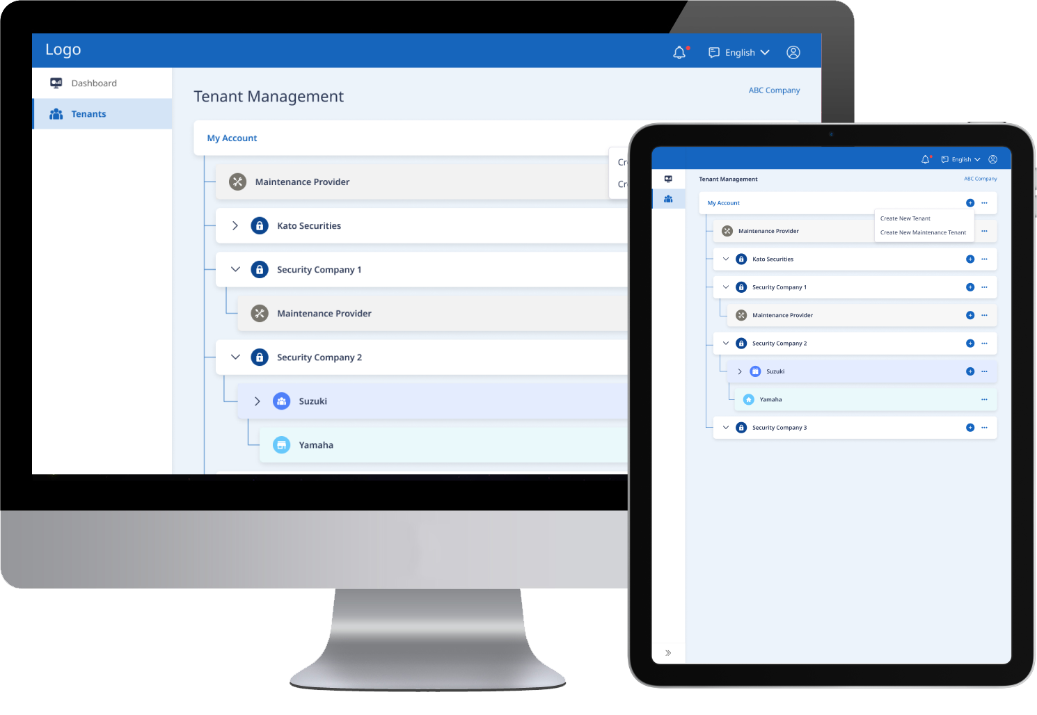
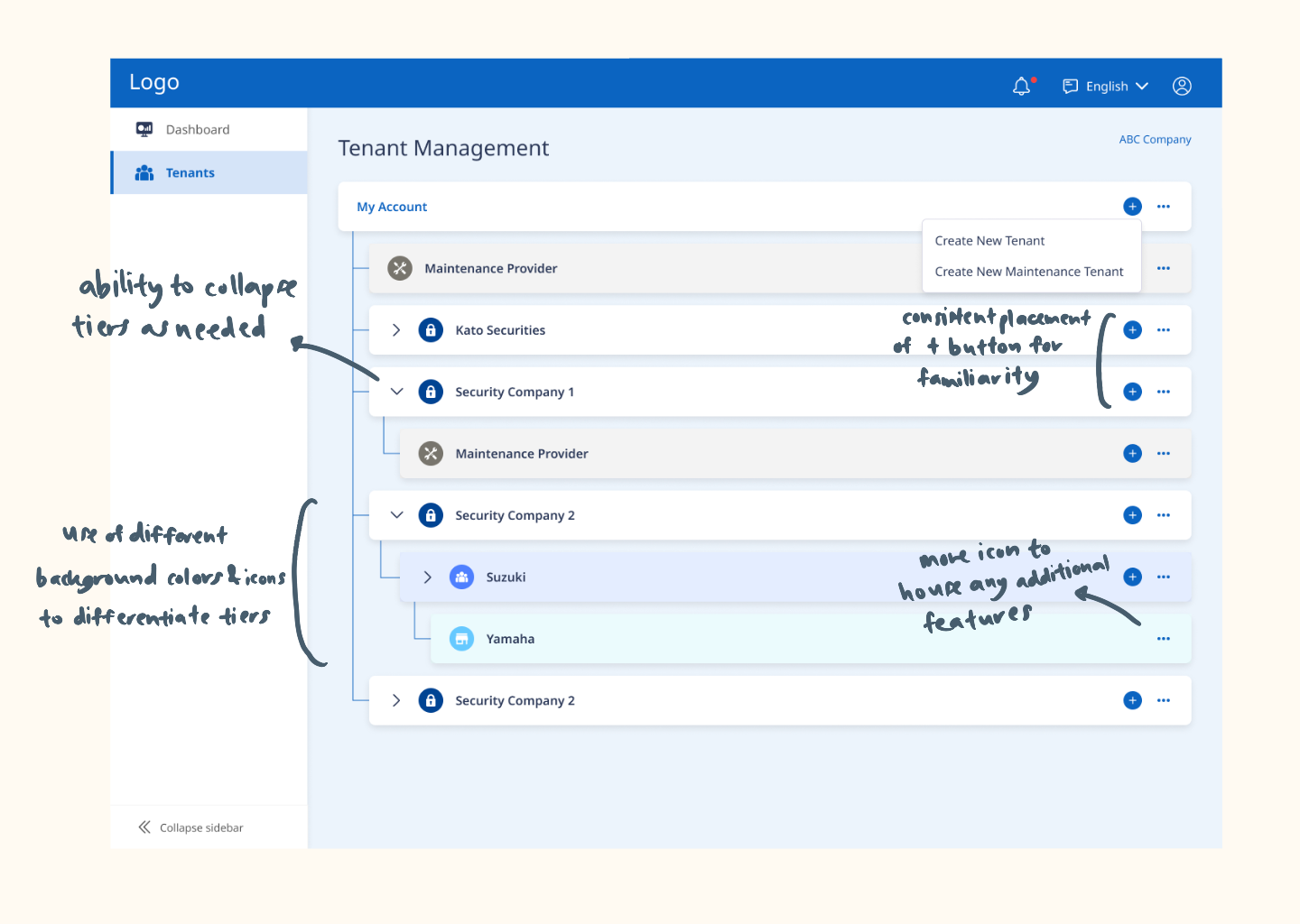
Nested Group Function
Before : In the dashboard that we are designing, there is a need for our users to manage their tenants in a hierarchical format.The functionalities include being able to add new tenants under each hierarchy like an organisational chart.
The current layout using a horizontal chart design may be confusing since the tenants and subtenants are not displayed in an organised manner.
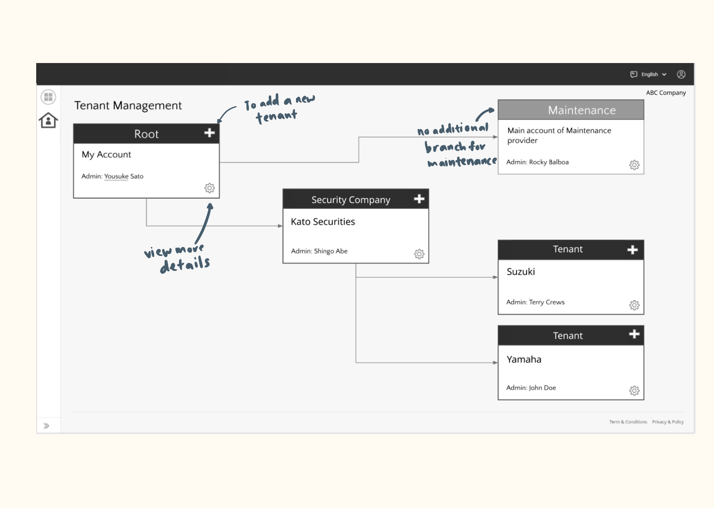
After : We went with a nested row option that could present the tenants, subtenants and more clearly by hierarchy. This layout will also cater for many additional rows if there is a need, where users can scroll vertically. Here's the solution:
- The Add function is demonstrated clearly to create new tenants under each user.
- Icons and background colours are used to make differentiating the tiers easily.
- Chevron arrows are used so that users are able to manage their views as needed.
Dashboard Navigation
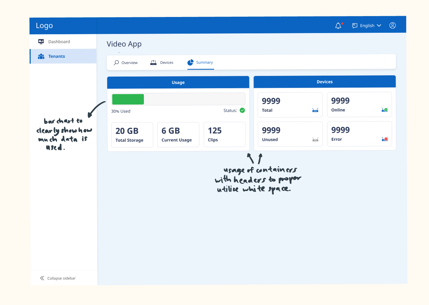
Before : When I'm tasked to redesign a dashboard to showcase a summary of storage usage, the initial idea was to have a pie chart to demonstrate the data.
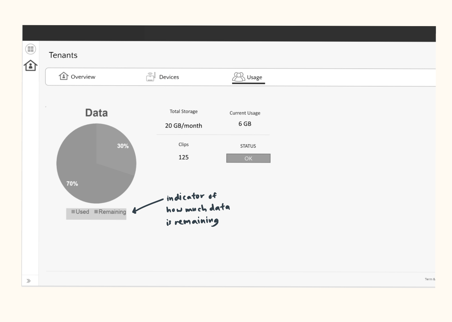
After : We decided to go with a simple bar chart that would be able to illustrate to the users clearly at a glance. Using cards would also allow us to organise the information better.
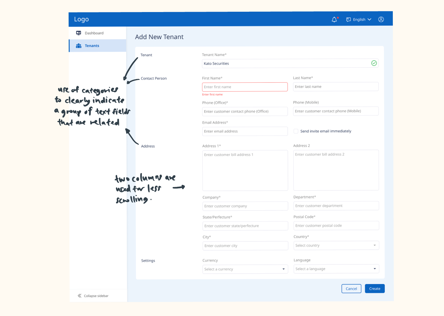
Form Redesign
Before : Redesigning forms have always been the most tricky part in my opinion, and I love the challenge that comes with it. Forms tend to be very long and uninviting, so my main goal was to make the experience most convenient and efficient for the users.
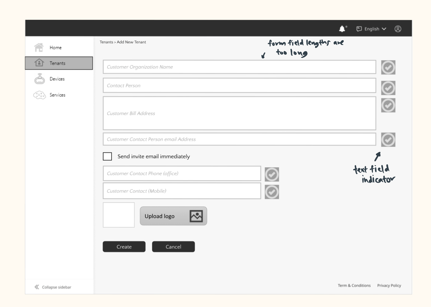
After : Instead of displaying a whole chunk of text, I made use of categories that are clearly laid out on the left. I utilised white space instead of dividers to differentiate the categories. A clear label is used above the text box so the user will always have a reference on what field they are inputting.
Final Deliverables 🖊
At the end of the project, we exported the final designs for all breakpoints to Zeplin, a handoff tool that simplifies collaboration with developers by providing all the specs and ready-to-implement CSS. These designs included all the screens for the features we had been working on, including different states, breakpoints and edge cases. We also crafted a UI kit with clear guidelines that would help the developers keep design consistency when developing new features in the future.
Key Learnings & Takeaways. 🌱
After this project was implemented, our client experienced an uptick in productivity. The updated dashboard created a seamless experience for users to monitor their devices and download video clips. The side navigation we've introduced also improved the way the apps were organised and allowed users to locate information quickly.
Here are some key takeaways from this project:
01
Designing for responsive.
To ensure that the website is widely accessible at all platforms, we have to design 4 sizes for each screen. This was a little challenging especially for mobile sizes since most of the screens are very content-heavy. I had to learn to squeeze in a lot of info in a limited space.
02
Put yourself in the users' shoes.
While no user testing was done for this project, it was important for us to constantly be designing for the user. We made up for the lack of user testing with discussions among our colleagues, readings and research.
03
It's important to keep your design files organised.
This project spanned about a year (on and off) and was handled by multiple designers at different timeframes. Due to this, we needed to keep our project files clean and organised so that anybody could come in and continue working on the design file.