Background. 🌈
Overview
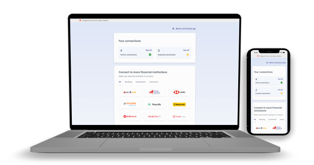
SGFinDex aims to enhance the usability of their website, enabling users to efficiently connect and manage their various financial information in a centralised view. The primary objectives are:
- Evaluate and ensure designs are compliant with Design Service Standards (DSS)
- Redesign for growing number of financial institutions
- Minimize cognitive load on users, get things done as effortlessly and intuitively
- Central focus of connection management, while incorporating an SGFinDex dashboard
This was an augmented role to GovTech and I was the sole designer for this project.
Problem
How do we enhance the current site’s user experience while incorporating a dashboard view for managing financial connections?
Role
UX Designer
User Flows, Interaction Design, Visual Design
March 2022 - July 2022
Note
❗To view the live site, click on the "Manage Financial Connections" button on this site here.
The process. 🍡
01
Understanding as-is state & heuristic analysis
I began by understanding the team's product vision, current pain points, and business requirements for the redesign. I then performed a heuristic analysis to identify design problems in the existing UI.
02
Establish design principles & building a DLS
My analysis revealed a lack of design consistency in their existing designs. There was also no reusable components or design principles established. I saw this as an opportunity to establish some foundational design guidelines for the team.
03
Iterative design process
We adopted a consistent design iteration process, maintaining an open feedback loop to balance user needs with business requirements. Once the team was satisfied with the design, I presented it to upper management to secure their buy-in.
Heuristic Analysis. 📓
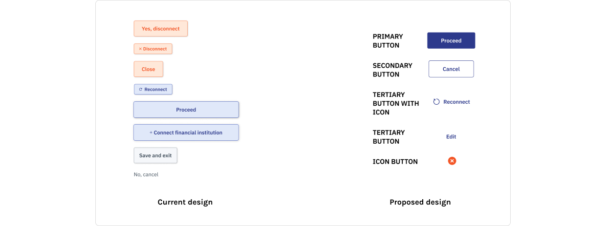
Problem 1: The use of colors and button sizes were inconsistent across the site.
Solution: Size and colour of buttons are kept consistent as illustrated in my proposed designs. This helps to establish a consistent button hierarchy of primary, secondary, tertiary and even icon buttons. In future, if there are additional features to be built, the team can always fall back on this established guideline to expand on their website.

Problem 2: Users need to dismiss a modal after disconnecting a financial institution, causing unnecessary friction.
Solution: Implement non-intrusive toast notifications for success states. Toast notifications close the action loop smoothly, do not require user interaction to dismiss, and disappear automatically after 5 seconds.

Problem 3: Current error flow create a disjointed experience and fail to guide users on resolving system errors.
Solution: Implement updated error messages that dynamically suggest reconnecting to the financial institution, coupled with intuitive redirections. This approach guides users towards actionable steps to resolve errors effectively.

Establish design principles and DLS. 📝
Key Design Principles
While working to understand the product team’s vision, I helped translate their ideas into key design principles that would serve as the foundation for updating their website's design. These design principles guided our decision-making throughout the project, allowing us to create a user-centred, intuitive, and visually cohesive experience.
- Focused view - User sees content that are relevant to their task flow or helps with completion of task
- Keep content clear & intuitive - Supplementary content that are not critical to the completion of task is presented in a non-intrusive way
- Aligned with DSS guidelines - Site should be accessible, inclusive, relevant, & usable.
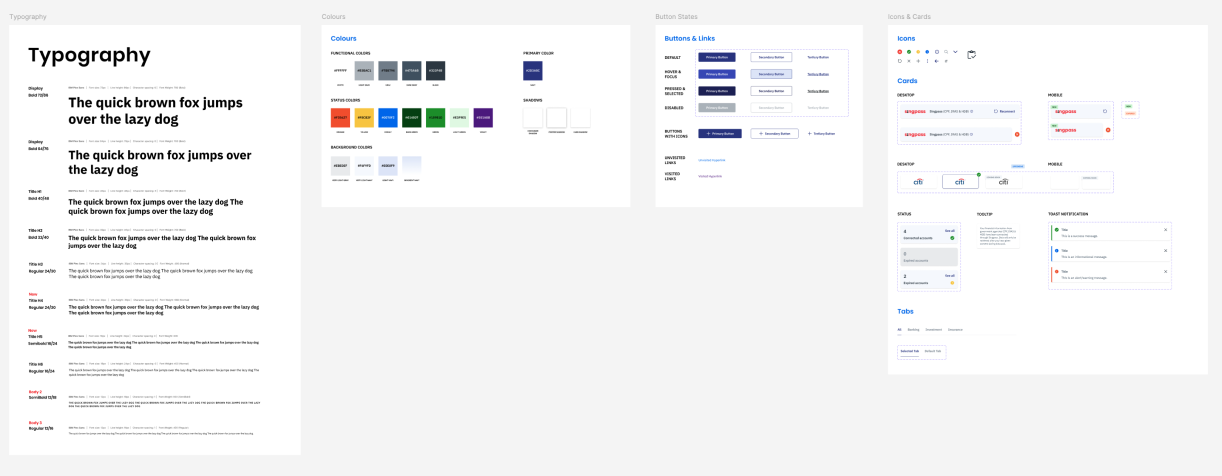
Design Language System
I also developed a design language system to ensure a consistent visual and interaction framework across all touchpoints. This approach enhanced the website’s usability, resulting in a scalable and adaptable interface that significantly improved user satisfaction and engagement.

Site audit for alignment with DSS. 🔍
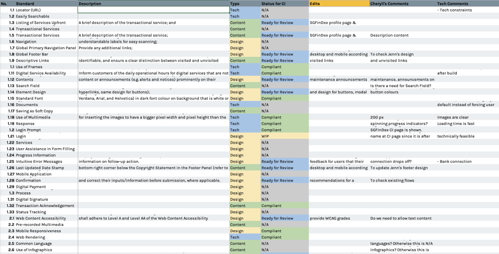
I established a systematic tracker so that each Design Service Standard (DSS) is evaluated together with the technical team to ensure that our website meets the compliance standard of the DSS. This allows the team to gain visibility on which element is compliant or which needs to be improved on. Together with the technical team and product manager, I facilitate discussions on what changes are needed to the website to adhere to the DSS.

💭 The Digital Service Standards (DSS) is a set of standards and guidelines which helps Government agencies in implementing digital services that are easy to use, seamless and relevant to citizens and businesses. All Government digital services must meet the DSS.
Key Learnings & Takeaways. 🌱
The website I designed is now live on site and is used by so many Singaporeans to manage their finances everyday. I feel glad to have made a small difference in people’s everyday lives.
Here are some key takeaways from this project:
01
Communication is key, always.
Every product team works differently, and in this project, the product team has never worked with a UX designer before. I find that over communicating helped the team understand where I was coming from whenever I was making design recommendations.
02
It's good to have a recommended solution.
Whenever I propose designs, I narrow it down to two solutions, each with a list of pros and cons to be tabled for discussion. I find that it is more helpful for my stakeholders when I have a recommendation from a design perspective to help the team make a decision.
03
Learning to work alone takes time.
It was my first time in a design project alone, and I find that I doubted myself a lot as I did not have much experience. It took a while for me to read up on theories, concepts and find my footing but this project eventually gave me more confidence in my own abilities.
