Digitalising a traditional sales workflow for multiple roles.
Background. 🌈
Overview
Property sales agents that deal with homebuyers go through a lot of back and forth processes on filling up paper forms. Some routine business processes include:
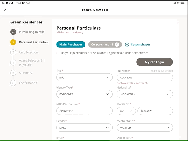
- Onboarding homebuyers & registering interest
- Viewing available homes for sale
- Dashboard to view home unit charts
- Approving, editing, reviewing & uploading contracts
I was tasked to digitise this paper workflow to reduce extra rework of paper forms and improve communication between different parties via a shared application.
Problem
How do we digitise the current paper process to ensure a smooth workflow between different departments and multiple parties?
Role
UX Designer
User Flows, Wireframing, Visual Design, Prototyping
June 2020 - September 2020
Note
❗Due to NDA, I can only share a broad overview of this project. Some images may be altered. Please reach out to learn more!
The process. 🍡
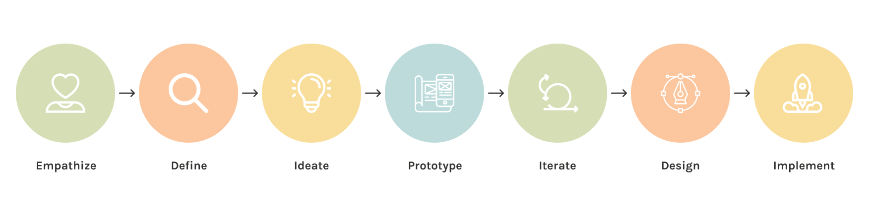
We kicked off the project by running weekly UX workshops to understand our client's current workflow, pain points, different roles involved and their ideal journey. A goal-setting session was also included to ensure that we are in sync with their high-level direction and objectives. We also took the time to understand jargons used in the property industry.
My role included designing user flows, wireframing, setting up the initial design file, prototyping and coordinating meetings with stakeholders.
💭 This project was run completely remotely in the midst of the COVID-19 pandemic. It was an interesting challenge.
01
Mapping User Journey.
We needed to understand current processes, how different parties work together and main pain points users were facing before drafting up solutions for their use case.
02
Brand Adaptation.
The UI Design had to match existing applications to ensure the app feels cohesive with their branding.
03
Validation of Designs and Technical Discussion
Development work was done using a modern application platform called Outsystems to accelerate the development process. We had to adapt our designs depending on the capabilities of Outsystems.
Gathering Requirements. 📓
From the workshops, I synthesised the information into a customer journey chart which included the actions taken, people involved, forms and tools used, and recommendations of an ideal journey.
Flowchart Mapping
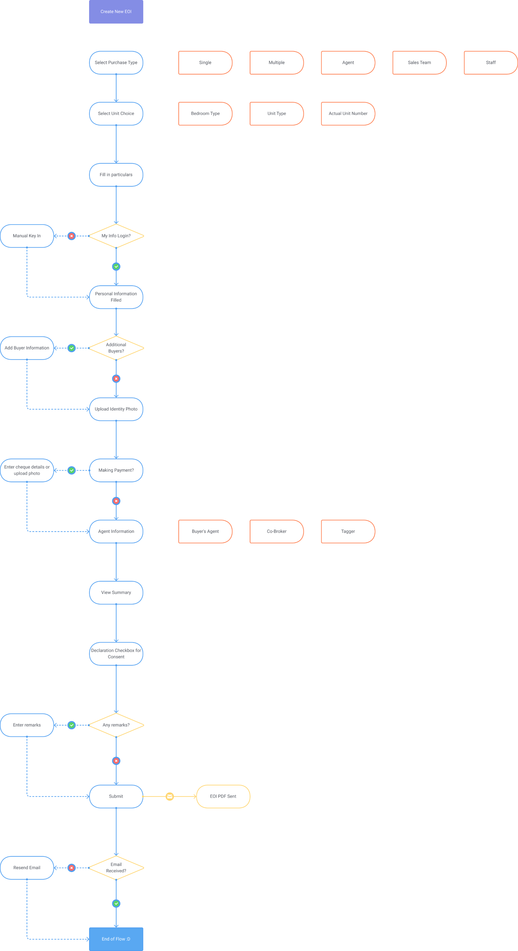
💭 Here's one of the detailed customer journey flows. I always draft a flowchart first as a visual communication tool to clarify things with the client. It also helps identify any missing flows that I may have overlooked.
Broad Overview of Tasks for Different Roles
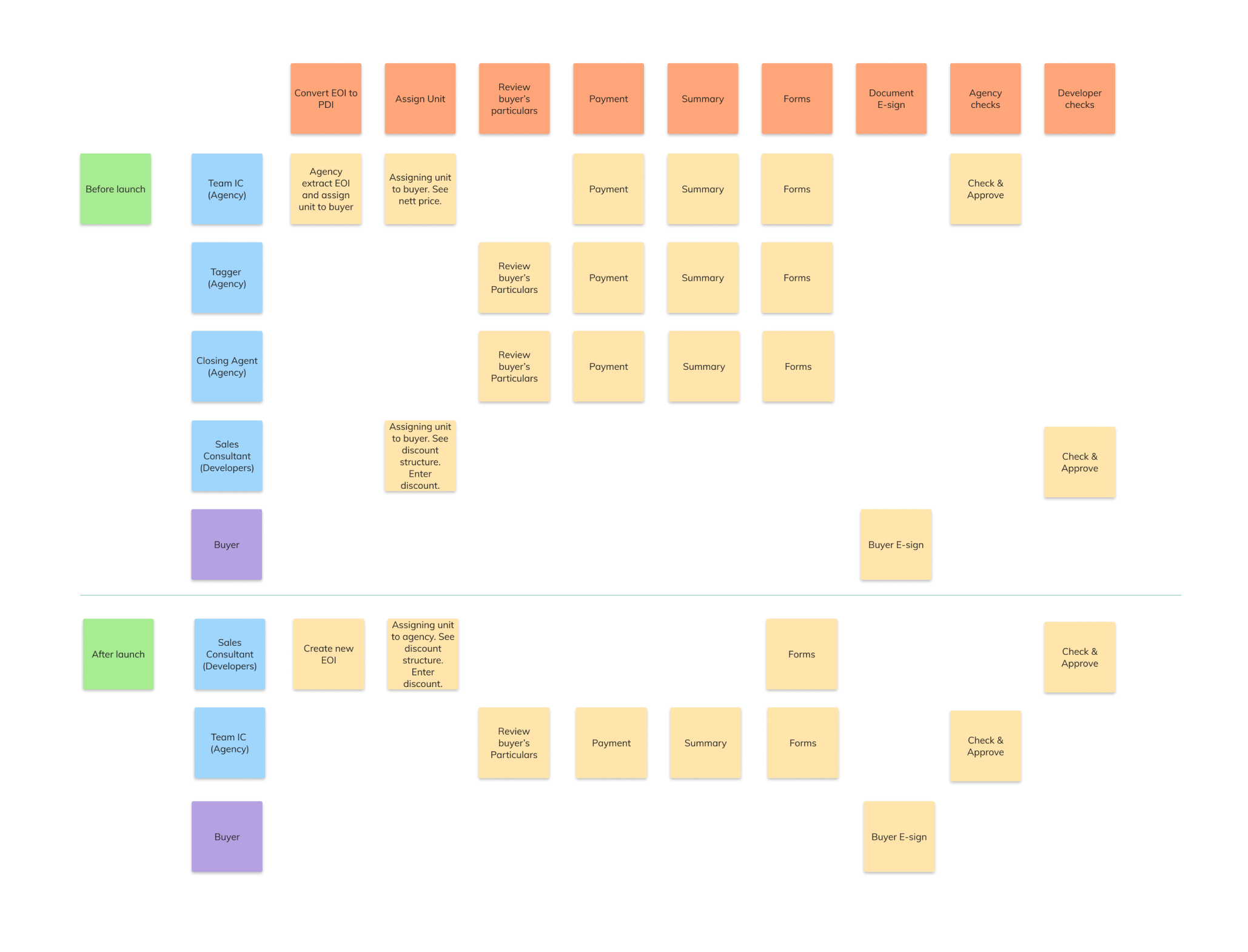
💭 We needed to iterate the flows along the way, so this is just a broad overview.
Designing for different personas/roles. 🔍
There were 2 problems that I was trying to solve while planning out the wireframes since there are multiple roles that we have to cater for.
- How do we ensure that the dashboard can cater for multiple roles handling a single case?
- How can we organize chunks of information so that it’s easily digestible?
I had to ensure that each flow is clear and concise enough that if somehow there was an exchange in personnel for a single case, the next person could just pick up the pace at once.
Admin/Property Developers
- Assign home units to Sales Agent
- Sets home property pricing and discount structure
- Final checking and approval of all forms
- Full access to dashboard
Sales Agent
- Curates homebuyers
- Helps homebuyers fill up particulars
- Check on payments
- Ensures buyer signs forms on time
External Agents
- Helps homebuyers fill up particulars
- Limited access to most of the dashboard
- Able to view progress of each stage
Coming up with solutions. 🖊
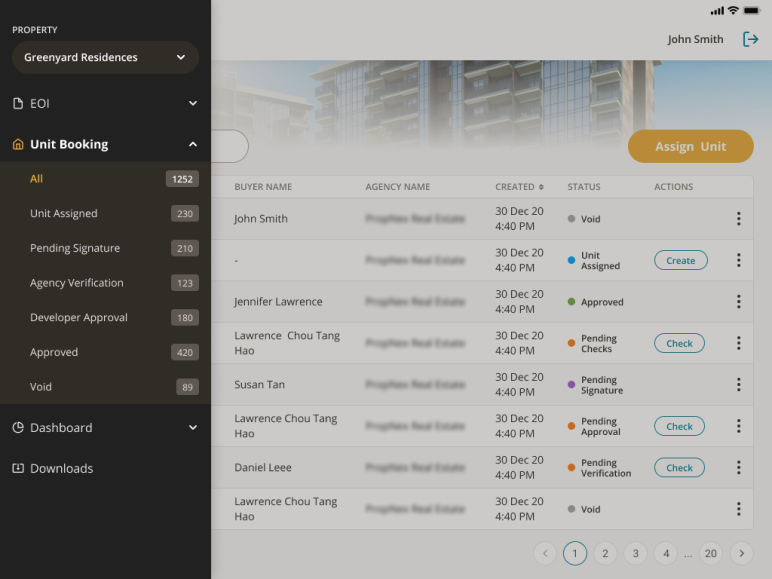
Problem 1: How do we ensure that the dashboard can cater for multiple roles handling a single case?
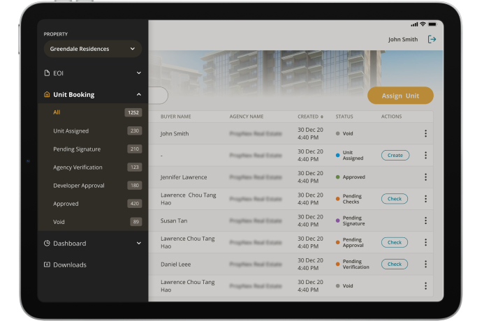
Solution: Side navigation with steps. This allows each role (whether they can or cannot edit the flow) to see how the case is progressing and if there is an action needed from their part. Notifications are used to alert users when there is an action that needs to be taken.
💭 Upon presenting this solution to our client, my client exclaimed, “Wow, that is such an interesting way to solve this issue! I’d never think of that.”
I’ll always remember that Eureka! moment.
Problem 2: How can we organize chunks of information so that it’s easily digestible?
Solution: Breaking it down in steps. As users are expected to fill up forms with a lot of fields, the UI has to be simple yet able to organize information in a readable manner so we don’t overwhelm the user. I went with a side-step navigation on the left that is sticky. For long forms that are optional to fill, they are hidden in tabs.
Key Learnings & Takeaways. 🌱
Since the implementation of the new Property Booking app, productivity has increased by 100%. Contracts and forms are now easier to manage, and time wasted keying in data from paper forms can be used more efficiently. Of course, for every new system/workflow introduced, there is bound to be a need to educate users on how to change from their traditional workflow to a more digitised one. In the long run, it will be beneficial although there may be some friction to adopt new ways in the beginning.
This was the first time I led a project. While I was nervous initially, I learnt to trust my teammate and weekly stakeholder meetings were key to the project's success.
Here are some key takeaways from this project:
01
Keep asking questions.
No matter how mundane or obvious you feel the question may be, it’s always good to ask questions. Don’t be afraid to clarify jargons that you are not familiar with because it will definitely help you understand better.
02
Set up your files right from the start.
As the lead of this project, I set up the design file in Figma with components & styles from the beginning. This was important so we could convert the wireframes immediately to UI once the branding direction has been decided. We also had a very tight timeline so we were crunching for time.
03
Be agile.
Plans are always susceptible to changes since business requirements constantly change. That's okay, we should always adapt and iterate the designs to meet new requirements.