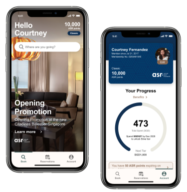
Leveling up hotel stays with the Ascott Mobile App
Background. 🌈
Overview
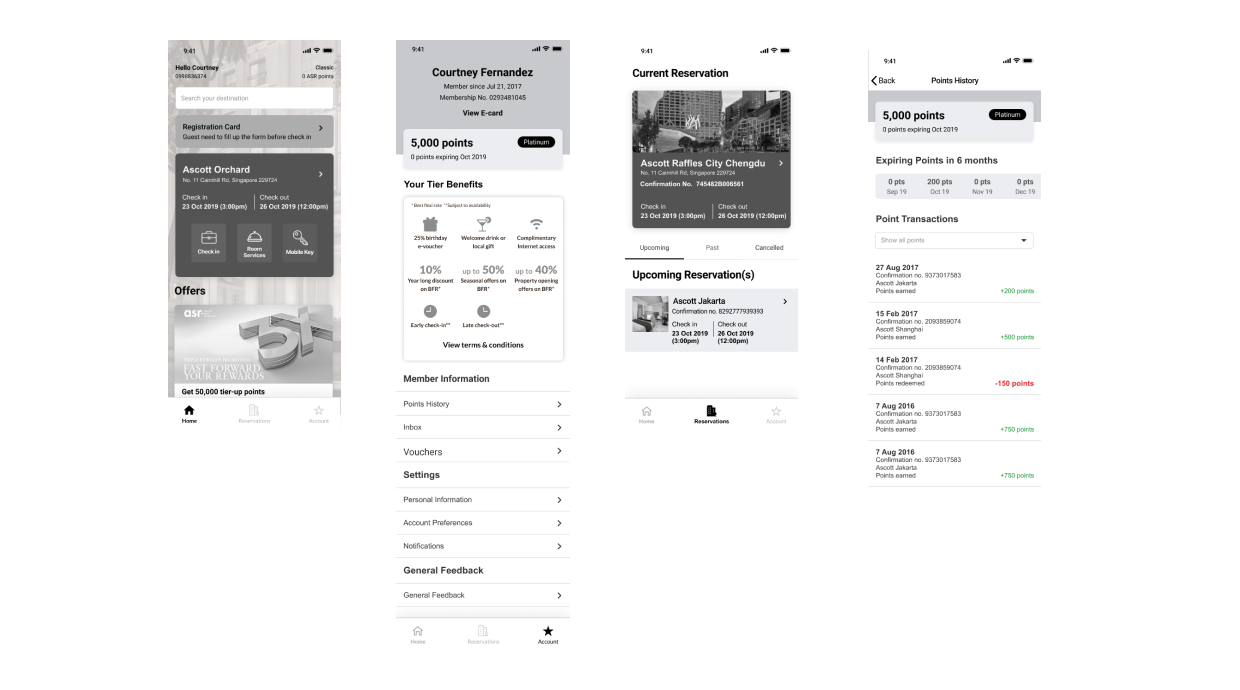
I was tasked to design the new Ascott Mobile App, which includes features like:
- Search & booking stays
- Contactless Mobile Check In + Check Out & Mobile Room Key
- Self-service in-stay services & payment
- Social Wall community
- Loyalty Membership & Points program
Problem
How do we design an intuitive mobile booking, check-in and self-service app for customers while adapting to current offline practices?
How do we incorporate Ascott’s loyalty program features as part of the app experience?
Role
UX Designer
User Flows, Visual Design, Prototyping & Testing, Market Research, UX Writing
August 2019 - December 2020
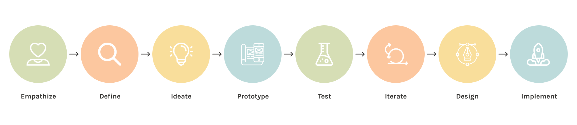
The process. 🍡
Gathering Requirements. 📓
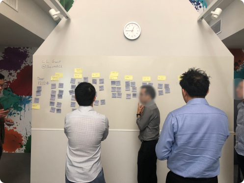
Customer Journey Workshop
The project kicked off with a Customer Journey Workshop using post-its with our stakeholders from every department - Marketing, Operations, IT, Services. It is important to understand how things are currently being carried out before we can recommend solutions.
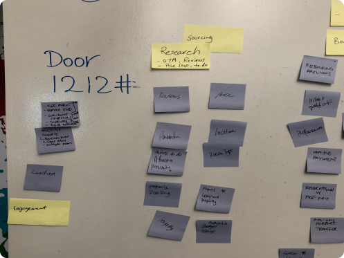
Sketching Out the Flow
Using our office’s trusty ol’ whiteboard, I sketched out how an ideal customer journey would look like to me.
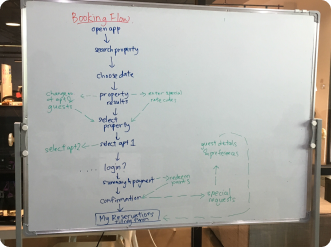
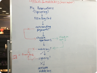
💭 This is usually the part of the project I enjoy the most and I love to sketch it out instead of using digital kits so I could really think while I write.
Market Research. 🔍
I dove deeper into the realm of online hotel bookings by looking at various other related apps to get inspired, and compiled my research into a deck to show our stakeholders for discussion.
Multiple-room booking function was unique and easy to understand.
Minimalist UI design & efficient information organization within the app.
Booking & payment flows were very seamless.
Search flow functionality is efficient and minimised steps taken.
Wireframing the solution. 🖊
Taking in all of the information that we’ve gathered, I started addressing certain pain points that our stakeholders have pointed out with these solutions:
- Reducing the number of steps for users to complete their search to book journey.
- Designing cues to notify users of next steps from booking to check in.
- Syncing up flow and entry point of existing app and new app.
- Establishing a consistent voice throughout the app and making sure the copy is clear for users to understand.
💭 I had to learn how to use Figma and understand what “wireframing” really meant all at the same time!
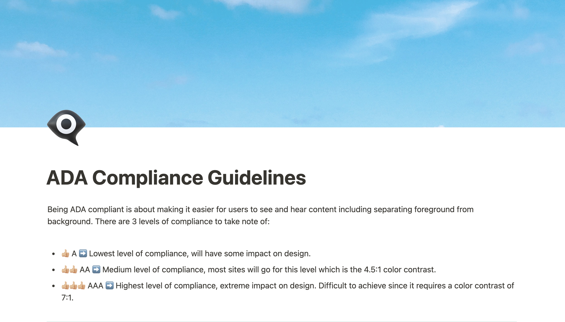
Designing for accessibility. 🗨
We also had to design for accessibility according to ADA compliance guidelines. This means ensuring that the text spacing is ideal, color contrast of icons and text is sufficient, and error or information inputs are able to be detected easily. A Figma plugin and a color contrast checker was used to achieve a Medium level of compliance.
I wrote an ADA Compliance Guideline for future references for my colleagues' perusal.
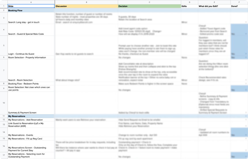
Stakeholder alignment. 🗃
We meet weekly with for a continuous process of iteration and designing to allow us to design better solutions.
Some key learning points from these stakeholder meetings are:
- We’ll always need to keep track of any decisions made during the meeting because in huge projects like these there’s a huge tendency that goals may change along the way.
- It is important to keep a severity score (Minor, Major) to prioritise our efforts based on the timeline.
💭 It's always interesting to ask important questions that will trigger them to think about their customer journey.
I also learnt that goals can change very quickly and it is important that I adapt our solutions together with their business goals.
💭 Meeting notes are the MOST important things ever. Always. Be. Taking. Notes.
Validating the designs. 👥
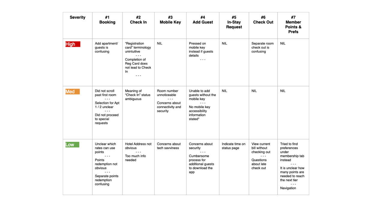
My colleague led the usability testing sessions, and I helped out with the tests.
I prototyped the screens on Figma to test major flows. After the session, we identified patterns and summarised our findings in the table below based on the severity of the problems we discovered. What followed was a presentation of the research findings to our stakeholders for further discussions on how to iterate our designs to resolve higher severity problems.
💭 Users may not always behave as how we expect them to, so it’s always important to carry out usability testings.
UI Design & Development. 📱
My colleague led the branding adaptation of the look and feel of the project, and I assisted her with it to reskin our wireframes to hi-fidelity screens.
To ensure that our handover is done smoothly, I created a full-fledged prototype to onboard the developers and led multiple meetings to answer any clarification questions that they might surface.
💭 I always do a mix of UX and UI work since we are a small team, but I mainly lead the UX portion of things.
Key Learnings & Takeaways. 🌱
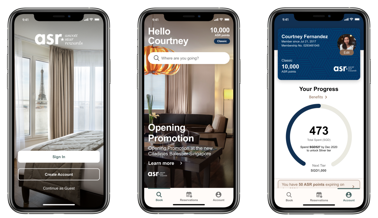
Since the implementation of the new Loyalty App, our client has seen an increase in hotel bookings from their mobile app instead of from travel agency sites. This is important for Ascott to improve member acquisition and onboard guests to their loyalty programme.
I was glad to be able to work on this large-scale project that exposed me to so many different features just on an app alone! :) There are so many more aspects to this project that spanned almost 14 months that I could not cover in this case study.
But here are some key takeaways from this project:
01
Involve developers as early as possible.
This will help to reduce a lot of rework as we’ll understand technical limitations upfront and could tweak our design strategy accordingly.
02
Things don’t always go according to plan.
Towards the end of our project, our client discovered huge technical limitations on their end and we had to rework the whole Search and Book portion. Sometimes there are limitations that we can’t plan for such as budget and time.
03
Communication is of utmost importance.
When dealing with any project, no matter how big or small it is, make sure that each step of the project is communicated to everyone in the team. This helps make sure that everybody is on the same page.