Redesigning human-centred digital service for public services
Background. 🌈
Overview
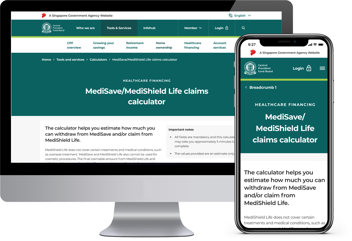
CPF has undergone a revamp to their legacy site that boasts a fresh look with improved usability. The CPF project is a mature project with complex Design Language Systems and guidelines that has spanned for 2 years before I joined the team.
I was tasked to redesign 4 specific forms within the CPF website:
- MediSave/MediShield Life cLaims calculator
- e-Health declaration for Permanent Resident applicants
- Pay HPS Premium Shortfall
- Application for Voluntary Housing Refund
Problem
How do we design forms that allow users to self-serve and complete transactions efficiently?
How do we organise content in a manner that is non-intrusive yet accessible on demand?
Role
UX Designer
User Flows, Visual Design, Prototyping & Testing, User Research, UX Writing
August 2021 - February 2022
Note
❗The implementation of this project will be launched in late 2022.
The process. 🍡
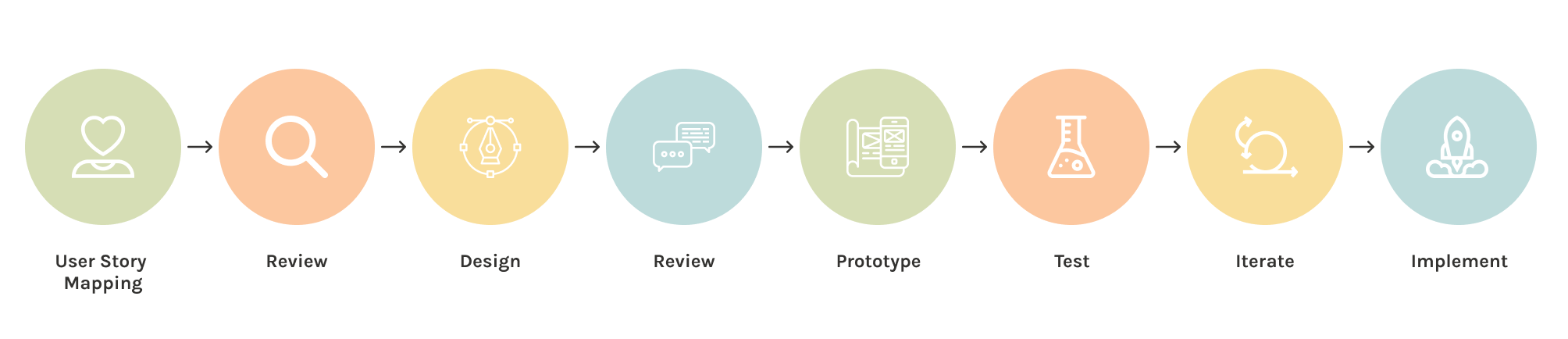
We adopted an Agile workflow and the whole project was run in 3 Sprints. Each design sprint lasts for 3 weeks. My role included:
- Mapping out user stories to help us work faster and discover issues quickly before going into designs.
- Working with different teams such as product owners, design language team, business analysts and developers to ensure communication and consistency across our designs.
- Prototyping and conducting user interviews to understand how users interact with our designs.
- Synthesise research findings and provide design recommendations based on user feedback.
The process is summarised as below:
💭 It was my first time in an Agile design sprint. It’s really exciting to see how all the moving parts come together.
User Story Mapping. 📖
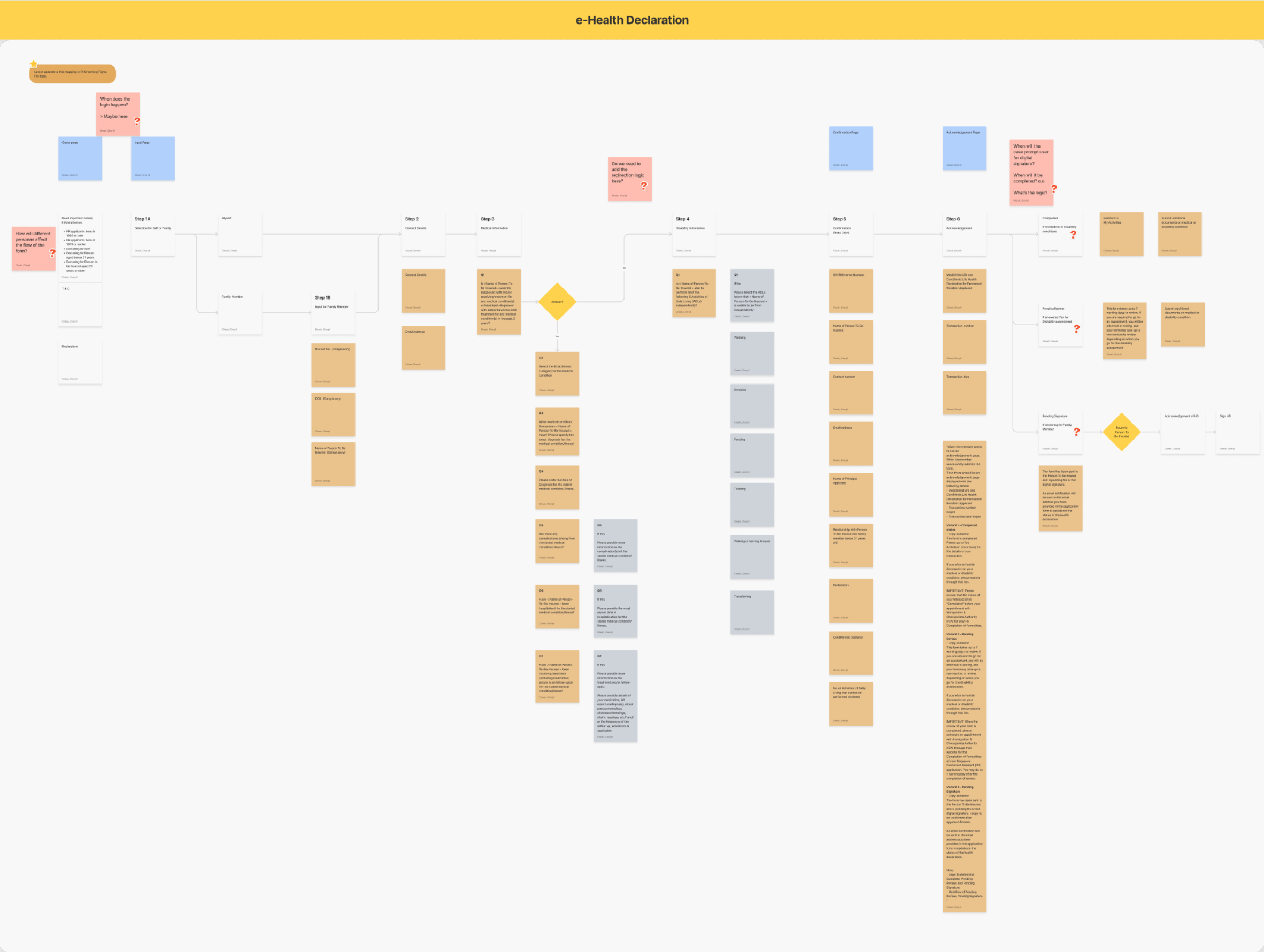
We started off with user story grooming together with the Product Owners. At this stage, it is important for us to understand how users interact with the forms, evaluate which steps have the most benefit for the user and prioritize our design efforts. By visually mapping out these user stories using FigJam, we are able to tell the story of the customer journey and envision the product from the user’s perspective.
Once the mapping process is completed, we’ll be able to uncover questions and identify gaps to check in with product owners to gain clarity. Discussions tend to be more focused here without interference of design and UI. Any gaps identified can also be easily alterable by adding story points that would help the user experience.
💭 I think the format of which the user stories are mapped out do not matter. The most important thing is that your product owners understand the story that you’re telling here.
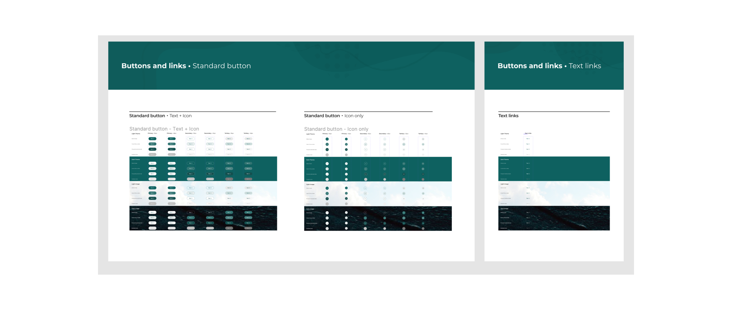
Designing with a mature Design Language System (DLS). 📏
Having a mature Design Language System meant that I’ll have to learn how to utilise the various components that are already available in the ecosystem. If there are no suitable existing components, I would have to propose new components that adhere to our guidelines and rules. This meant communicating with the DLS team as well as our front-end developers to ensure new components proposed are scalable, functional and consistent.
The benefits of using a DLS is endless, and I was happy to learn how to use it and collaborate with other designers in a conscious effort to align future builds with the DLS. Our continuous process of iteration ensures that our digital ecosystem is scalable in the long run, no matter how big it grows to.
💭 Honestly, I struggled with designing using the DLS. It is such an extensive library with so many components, rules and parent-child concepts that I was not familiar with. It definitely took a while for me to warm up to this.
Crafting solutions. 🖊
Modal Interaction for Operations Selection
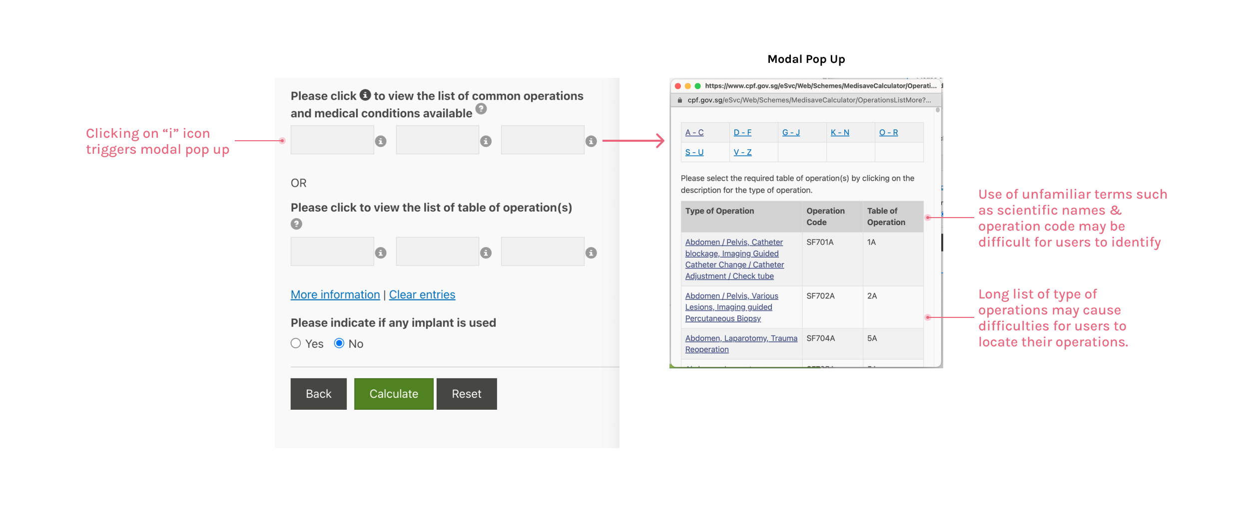
Problem 1: How do we design a modal for selecting specific operations that is user friendly and self-serving?
Taking in all of the information that we’ve gathered, the current form design is problematic because:
- Users may select up to 3 operations to include in their calculation, but it is not clear to users since there are 6 empty boxes displayed upfront.
- Use of the icon “i” to trigger modal pop up for selection feels counter intuitive especially when there are two hyperlinks “More information” and “Clear entries” below the question.
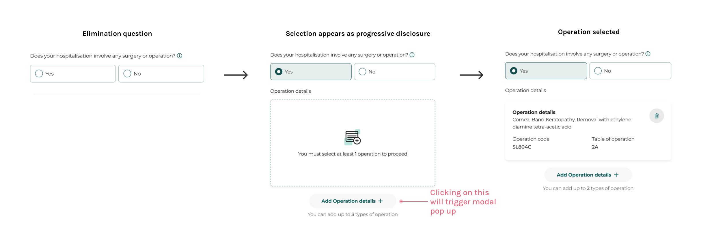
Solution: After many rounds of discussion and iteration, we are proposing this form design that is simplified and in line with our form framework. Some improvements as below were made:
- Since not all patients that are hospitalised will undergo an operation, asking this question upfront will help gauge users' need to select an operation. If the user has selected “Yes”, the option to select an operation will appear.
- As a default, users will only need to select one operation. There is an option to add up to 3 types of operation by clicking on the Add Operation button.
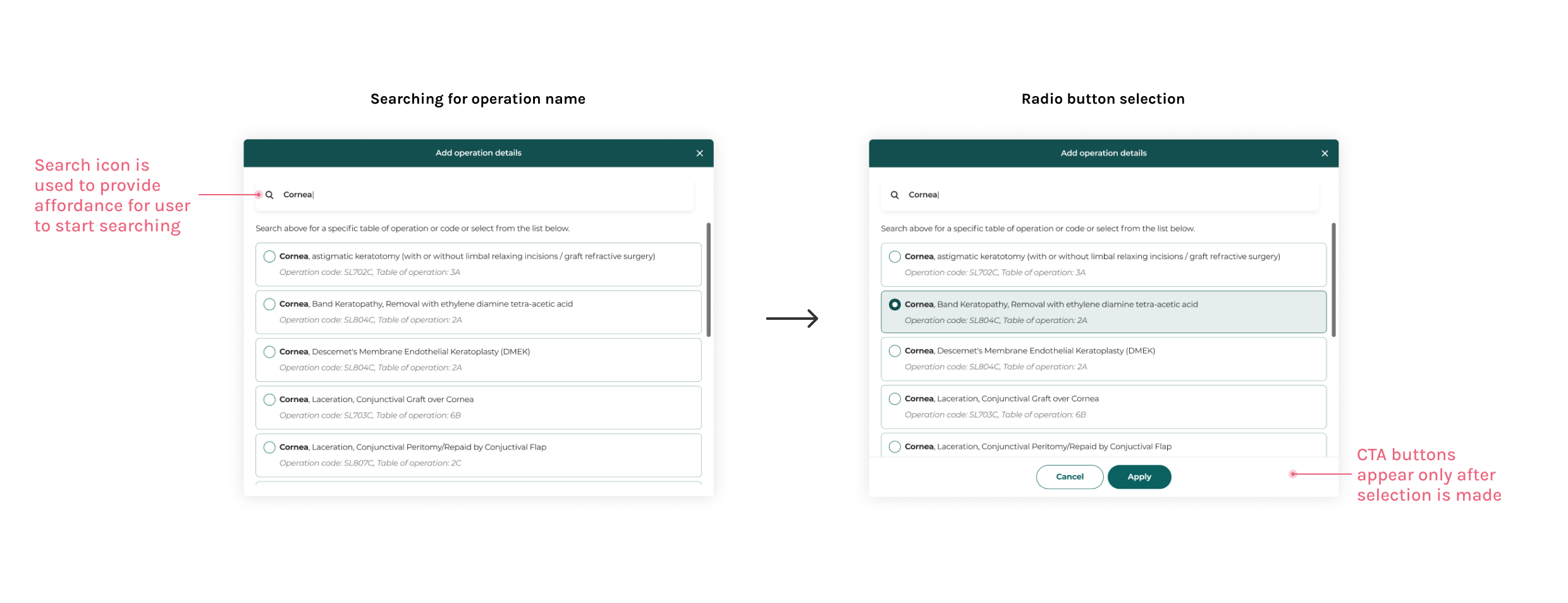
- We’ve also simplified the modal design to allow searching for operation name or code.
- Alphabet selection shortcuts were removed since the Search bar provides more value than allowing users to select from the alphabets.
💭 I spent the most time working on this form and modal section because there was a lot of uncertainties on how it is typically used and how we would like to guide users. Through continuous discussion, exploration and iteration, we've managed to design a modal that users could easily breeze through. Yay!
Error Flows
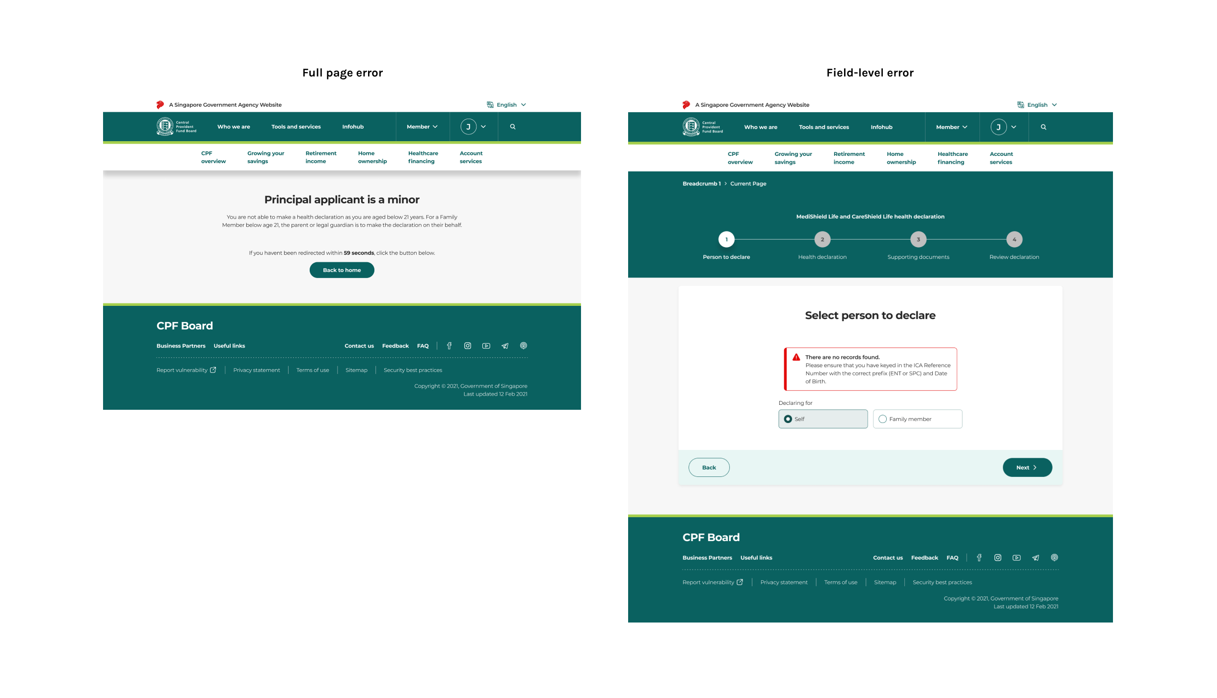
Problem 2: How do we design error states and pages to facilitate self-remedy for users?
Forms should be designed to reduce the possibility of error for users, but if something is wrong, there should be clear actionable steps for the user to self-remedy.
- I have proposed a full-page error design for error flows that are not induced by the user’s actions. This page includes an explanation text to explain the error and a CTA button to allow user to head to the homepage to continue other workflows.
- For errors that are induced by user’s actions, field-level error states are shown within the step itself that includes clear explanation for users to identify their errors.
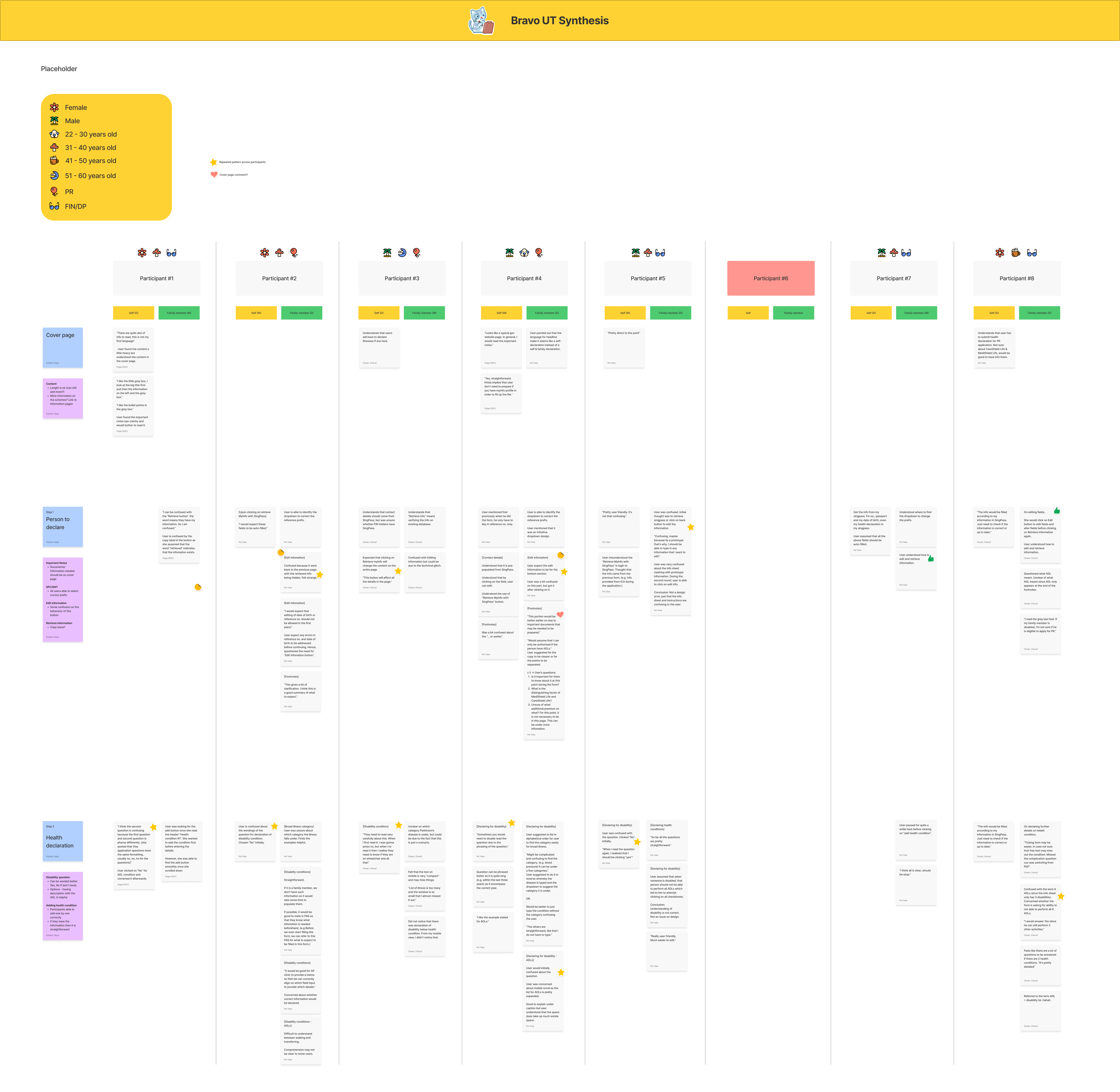
Validating the designs. 👥
In this project, I helped my colleague with the research plan, led the team to prototype screens on Figma and moderated interviews.
It is important to carry out usability testing sessions to validate what we've designed instead of relying on assumptions. Even though our forms are for very specific use cases, what I tried to do here is to simulate realistic scenarios to emulate real behaviors. What followed was a synthesis process to identify patterns and provide recommendations to our stakeholders so we can improve on our designs.
Key Learnings & Takeaways. 🌱
Being a part of this agile design sprint has been a huge learning curve for me. It was very enriching to work with different stakeholders that required myself to balance between design goals, user goals and business goals.
The forms that our team designed are still in development at the time of writing, but seeing our products pass our usability testing was definitely very fulfilling after months of work!
Here are some key takeaways from this project:
01
Retaining legacy users' behaviors.
It is important to not reinvent the wheel too much so users can still retain their sense of familiarity when using these forms. For every sprint, we took the time to test our prototypes to ensure that any design disruptions we’ve introduced to our users are adding value instead of adding mental effort.
02
Articulate design decisions better.
Since this project is at a rather large scale, I find myself struggling to articulate my design decisions especially when being questioned from various stakeholders. Reflecting on this, I realise I need to brush up on my soft skills to be a better designer that can balance various stakeholders' opinions.
03
Remember to look at the big picture.
At times when we're solving design matters, it can be easy to lose sight of our overall design goals we've established. Keeping sight of our design principles and asking the right questions will help steer us to the right decisions for more human-centred designs.