Background. 🌈
Overview
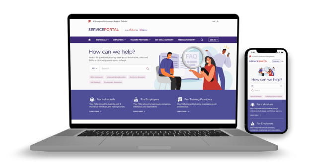
SkillsFuture Singapore (SSG) currently has several portals catering to different groups and needs across Singapore—from internships and upskilling to job searches and lifelong learning for retirees. However, having multiple portals has made it difficult for users to get unified support and service from SSG, leading to fragmented experiences and communication.
To solve this, SSG has teamed up with us to create a single, easy-to-use portal that brings all these services together. This new portal will not only provide all current functionalities but will also be scalable for future features like live chats and AI-powered FAQs to make user support even better.
I played a supporting role for UI design and conducted usability interviews in this 3-person design team project.
Problem
How can we consolidate multiple service portals into a single, user-friendly platform that improves the support experience for all demographics served by SkillsFuture Singapore (SSG)?
Role
UX Designer
Usability Testing, Visual Design, Interaction Design
July 2022 - October 2022
The process. 🍡
01
Empathising with our business users
We talked to key SSG stakeholders who interact directly with customers or manage their current customer-facing websites such as marketing and communications teams, customer service officers, and website product owners. This is to understand their current pain points and expectations for the new portal.
02
Designing the website
Using these insights and findings from our heuristic evaluation, we developed a new information architecture, content matrix, and visual direction to encompass SSG’s brand values, key objectives, and best-practice content layout.
03
Usability testing and iterative design
We then tested these designs with real users from our three main target groups—individuals, employers, and training providers—to identify any usability and experience gaps. The feedback we received was used to refine our designs and make continuous improvements.
Heuristic Analysis. 📓
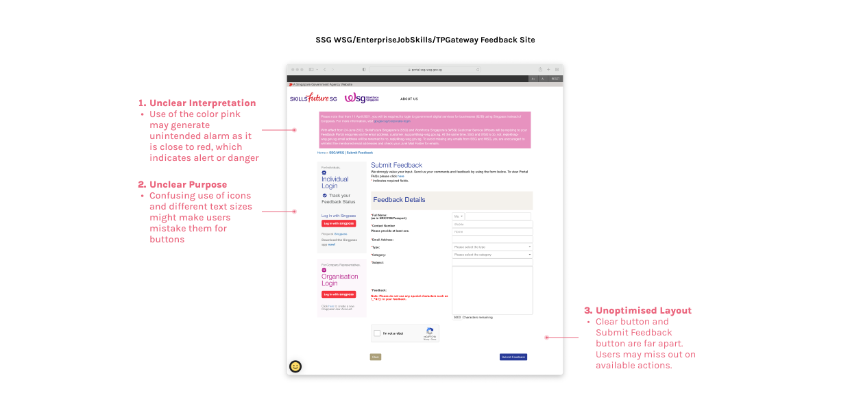
Streamlined button colours and sizes
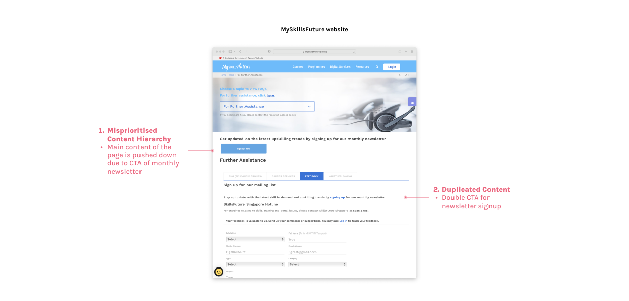
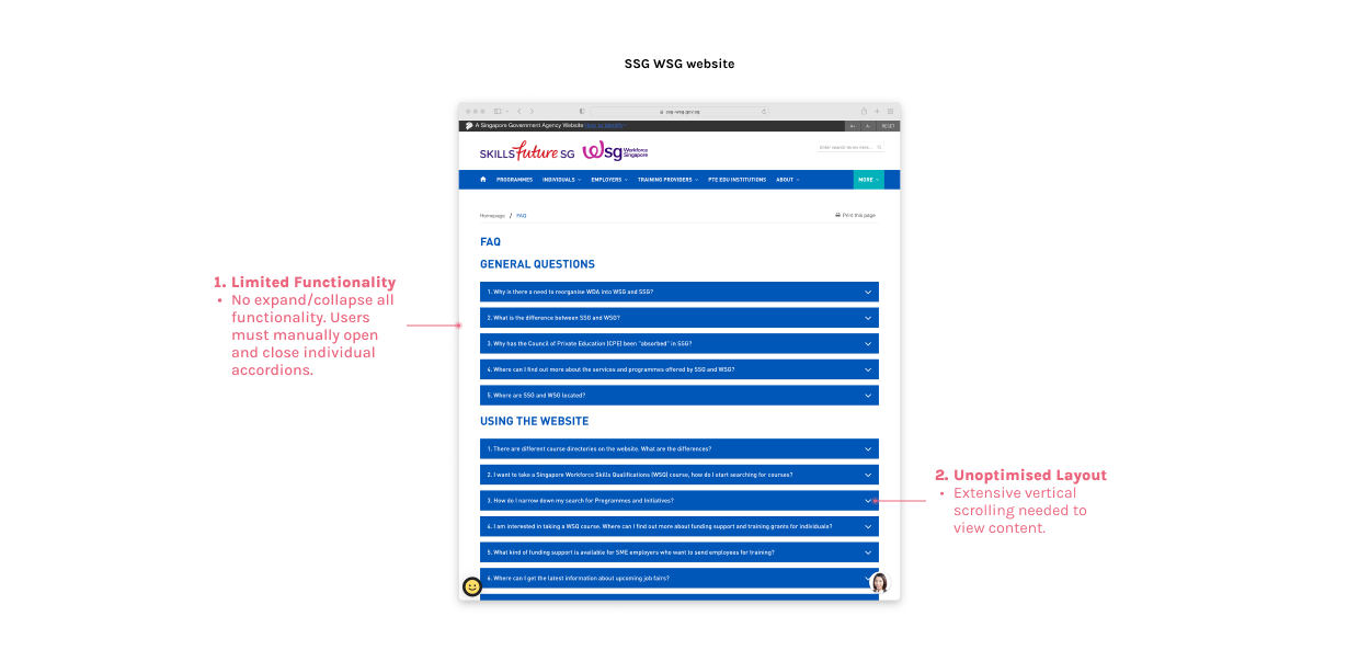
During our heuristic analysis, we conducted an in-depth examination of three websites that host SSG’s frequently asked questions (FAQs). We meticulously reviewed each site to identify usability issues, design inconsistencies, and content gaps. These insights will guide us in creating a more user-friendly and cohesive FAQ website, improving overall user experience and satisfaction.
Here's a quick summary of the key issues we uncovered: lack of intuitive navigation, inconsistent visual design elements, and outdated or hard-to-find information.
Proposed Visual Design. 🎨
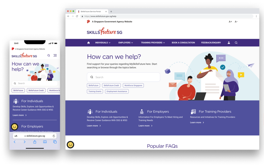
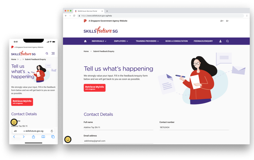
Our team came up with a design concept that leveraged on familiar design, layout, and mental models used by popular and commonly-accessed government web portals. Keeping in mind our heuristic analysis findings, we proposed a consistent and structured layout throughout the website to encourage reading in a logical, linear manner.
My teammate came up with the styling, colours and visual concept for the website. My role in this section of visual design was to contribute to building the components, organising the design language system and detailed screen design for various flows.
Usability Testing. 🧪
After going through multiple rounds of feedback with SSG stakeholders and design iterations, we carried out usability testing (UT) with actual end users who will be using the service portal. This is to enable our design team to identify gaps in the usability and experience of the portal from a users’ perspective.
We had two rounds of UT with a total of 12 users on both desktop and mobile prototypes. It was important for us to test on both devices since the user behaviour may differ from one device to the next. Here’s a summary of our process for usability testing.

An interesting note to share about this usability test - the concept of our UT was one that I have not tried before. Typically, the users have to complete a few tasks in a controlled prototype environment so we know if what we’ve designed is an optimal user experience. However, since this service portal that we’ve designed is to optimise the information hierarchy and enable users to search for answers from their frequently asked questions (FAQs), we decided to build a prototype that is almost a fully functioning website. This means that every link in the Figma prototype is clickable, and users can navigate anywhere and however they would like to.
It was definitely a new challenge for myself to be able to think quickly on my feet whenever a user does something unexpected with the prototype. I also had to strike a good balance between allowing users to have free reign to explore the prototype VS sticking to our test script so we can collect valuable data.
Key Learnings & Takeaways. 🌱
01
Adapt if things dont' go to plan.
During user interviews, I’ve learnt that I need to be prepared for various scenarios because we really do not know what type of users we are interviewing. It is best to understand the flows and test script well so that I can adapt to different flows if needed.
02
If time permits, test on multiple devices.
A user’s behavior on desktop and mobile may differ in terms of their mental model, and it is important to test on both devices. This is especially important in our mobile-first world today.
