Designing a homepage that helps HR admins manage engagement surveys.
Background. 🌈
Overview
EngageRocket is a B2B employee experience platform used by HR teams to run company-wide surveys, understand engagement trends, and follow up with actionable insights.
Most users log in during key periods of the survey lifecycle — usually when they’re setting up a survey or monitoring ongoing participation — and need a clear sense of what’s happening and what requires attention.
Role
I was the sole Senior Product Designer and led the end-to-end design process.
- Discovery through interviewing Customer Support team to identify real workflows (our closest proxy to users)
- Designing the homepage UI & admin content-management interface
- Collaborated with Product to define goals, scope, and priorities in the absence of formal requirements.
- Worked closely with Engineering to validate feasibility and align on backend constraints.
- Used AI (ChatGPT + Figma Make) to accelerate ideation, generate layout variations, and explore UI early.
Problem
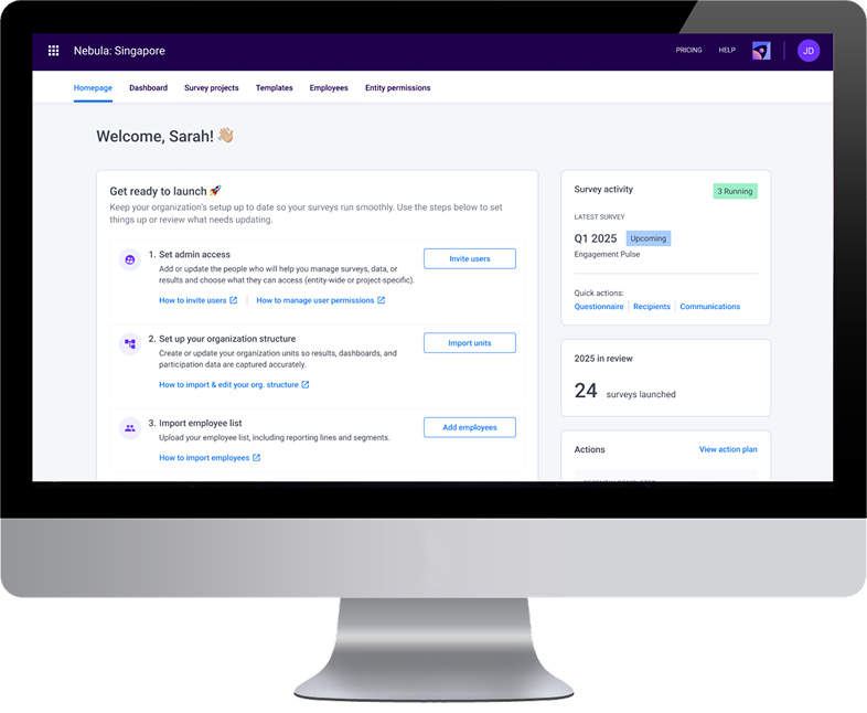
The dashboard was slow, resource-heavy, and not aligned with how HR admins actually work. This resulted in a poor first-touch experience and no clear guidance on what needed attention in a survey lifecycle.
How might we design a lightweight homepage that aligns with HR admins’ real workflows when running engagement surveys?
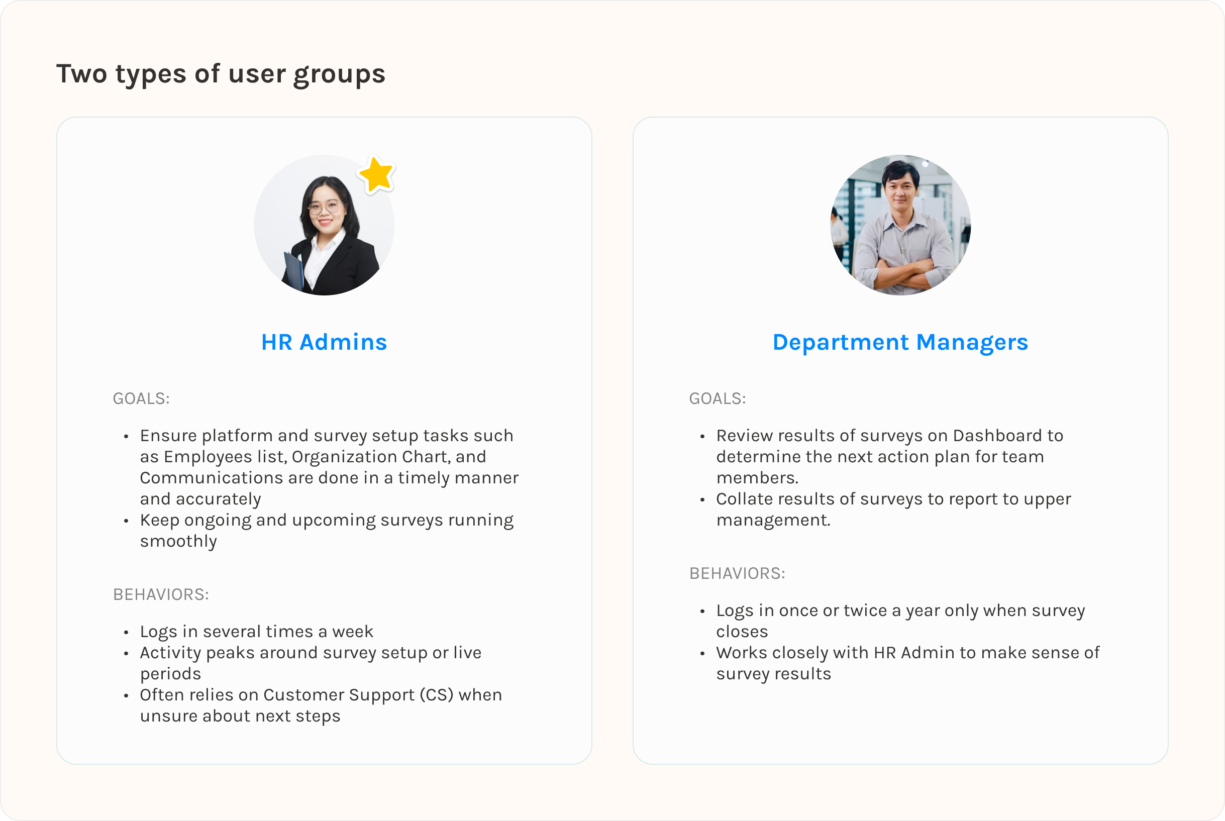
User personas. 👩
While there are two main user types, for MVP purposes, I will be focusing on our key users which are B2B HR admins responsible for setting up engagement surveys, monitoring participation, and coordinating follow-up actions.
Exploration of the problem. 🍎
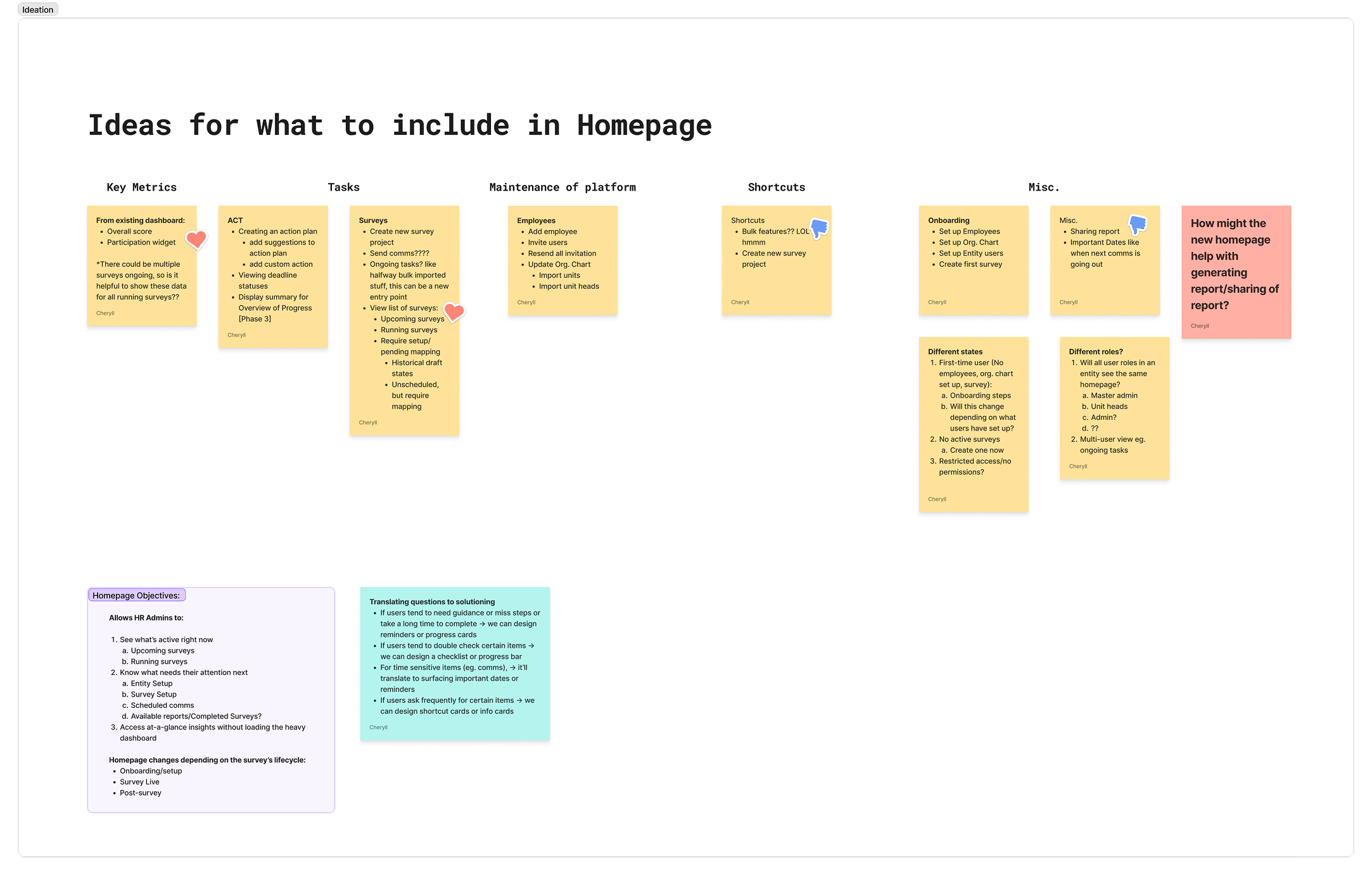
The initial problem space given to me was wide; simply “redesign the dashboard”, with no clear requirements or direction. I took a step back and explored how a landing experience could meaningfully support HR Admins' real workflows by creating an extensive list of homepage elements.
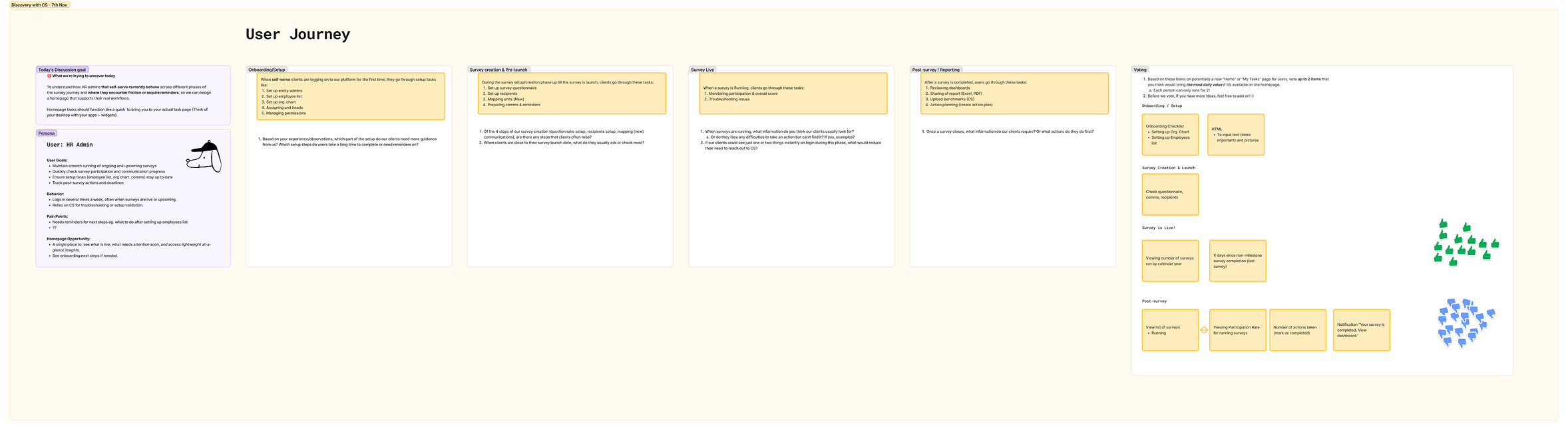
From there, I set up a discovery plan to interview our Customer Success team (which are the closest proxy users we have) to understand which of these ideas actually mapped to real workflows.
Discovery & Insights. 🎏
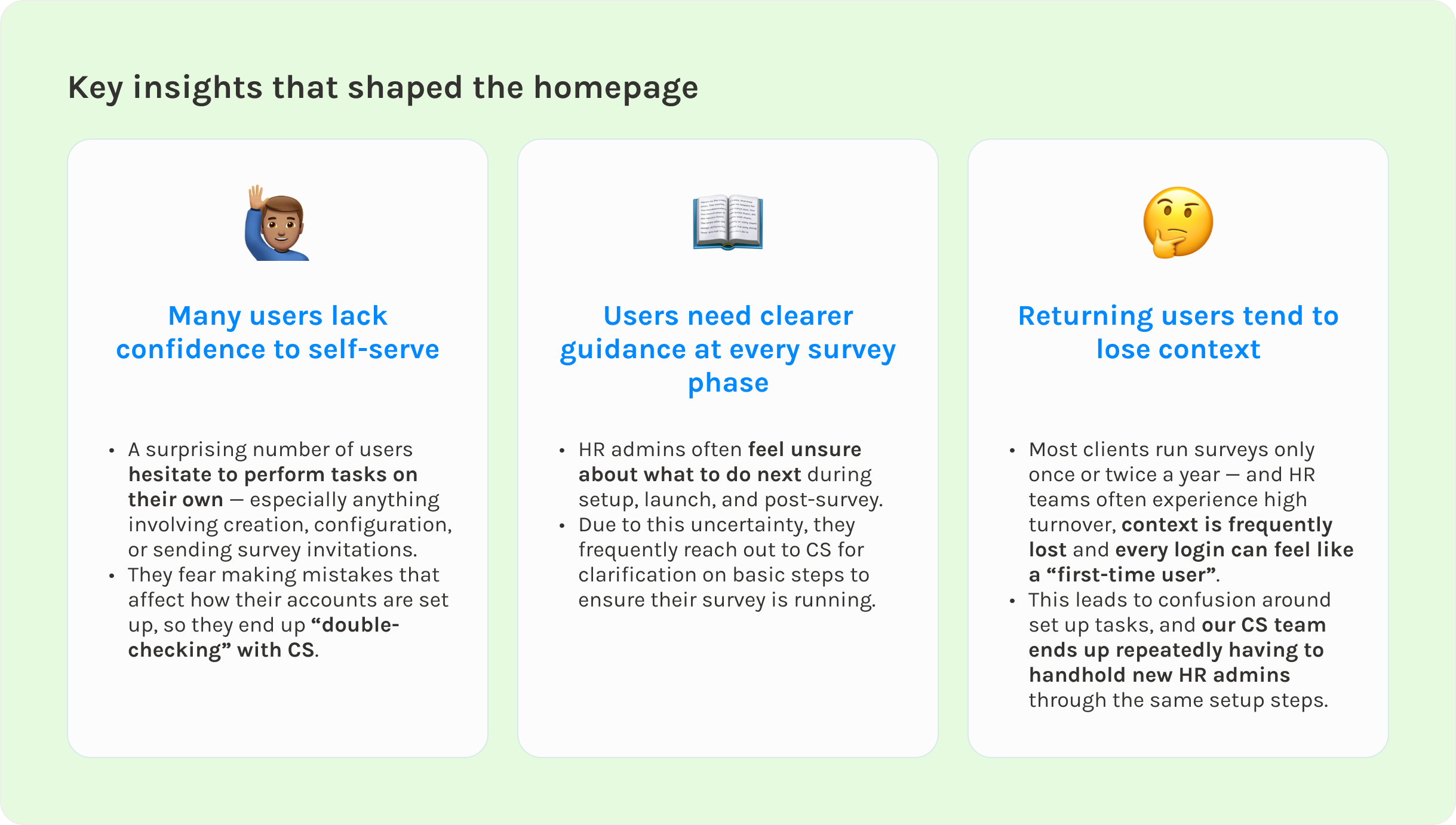
Discovery
I planned and facilitated sessions with our Customer Success (CS) team — the people who work closest with our actual users/clients since we could not interview our users directly. My goal was to understand how users behave across each phase of the survey lifecycle.
I focused on uncovering:
- What HR admins look for immediately after login
- What causes delays in setting up their surveys or errors
- What repeated questions CS receives when users are asking for help
- Where clear guidance or visibility would reduce support load
Synthesis
After the interview, I presented a list of homepage elements and asked CS to vote on which ones would deliver the highest daily value if surfaced on the homepage.
This helped:
- Validate assumptions
- Align stakeholders
- Narrow the scope to the most impactful elements
- Ensure we solved high-frequency issues, not edge cases
Quick iterations with ChatGPT & Figma Make (AI). 🤖
Once I understood the real problems HR admins were facing, I jumped into exploration mode. The design brief was broad, users lack confidence on next steps, and the homepage had to work for both a totally new user and someone returning six months later — so I knew I needed breadth before committing to a direction.
I leaned on AI as my creative partner, which is a great help since I’m the sole designer here. I started off with prompting on ChatGPT and once there’s a more concrete direction, I used Figma Make to rapidly generate different homepage layouts and content: checklists, card grids, guided flows.
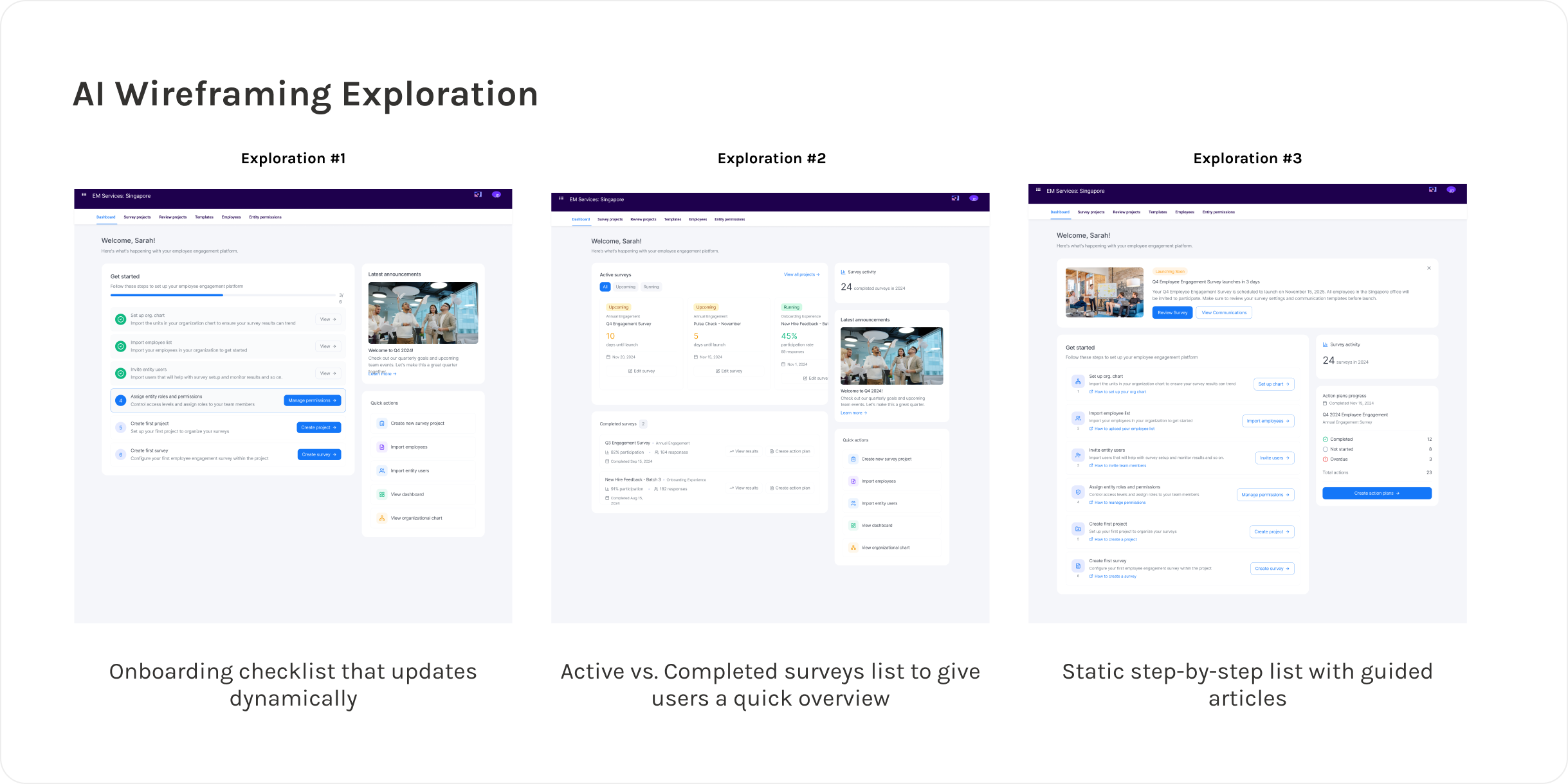
The goal at this stage was to stretch and uncover patterns I wouldn’t have thought of on my own. From there, I weighed the ideas against our actual insights:
- Would this help someone who only logs in once or twice a year?
- Would this reduce CS handholding?
Across dozens of variations, two highlights that really address the problems uncovered are the need for:
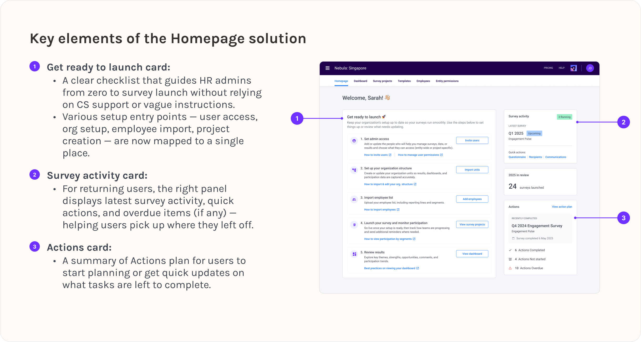
- A clear, structured step-by-step checklist for setup
- A right panel that supports returning users with quick access to live survey actions
Translating Insights & AI Explorations to Designs. ✨
Projected impact. 🚀
The redesigned homepage is expected to:
- Shorten time-to-setup for new admins
- Reduce total CS load by 25–35%
- Help HR admins self-serve with more confidence
- Improve dashboard load performance ~10–15%
- Increase adoption of action planning
Key Learnings & Takeaways. 🌱
01
It is important to adapt quickly amidst ambiguous direction
This project taught me how to move forward even when requirements were vague and product direction kept shifting. Instead of waiting for clarity, I learned to frame the problem myself, gather the insight I needed, and steer the team toward a workable scope.
02
Balancing ideal solutions with realistic constraints
I entered the project with a more ambitious, industry-inspired vision — but the team needed a lightweight MVP that could ship fast. Navigating this tension helped me become more pragmatic: designing for the actual context, not just the ideal one.
03
Lean on AI to help speed up ideation.
Leveraging AI-based wireframing let me explore layout variations and validate ideas within minutes. It compressed my ideation cycle and freed up time for higher-value decisions — like mapping user flows, aligning with the team, and refining what truly matters.